A Taste of Portugal
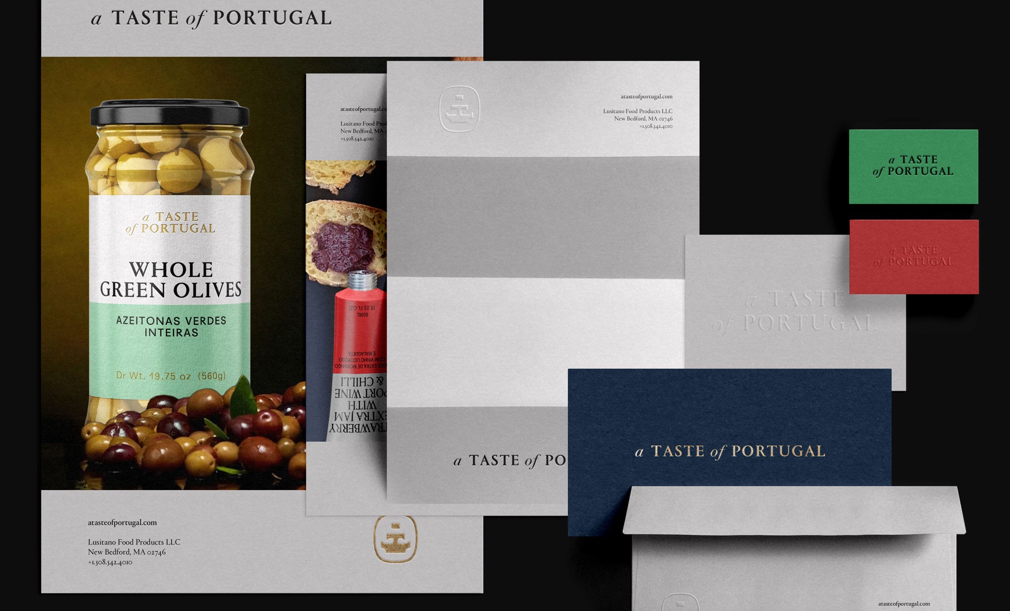
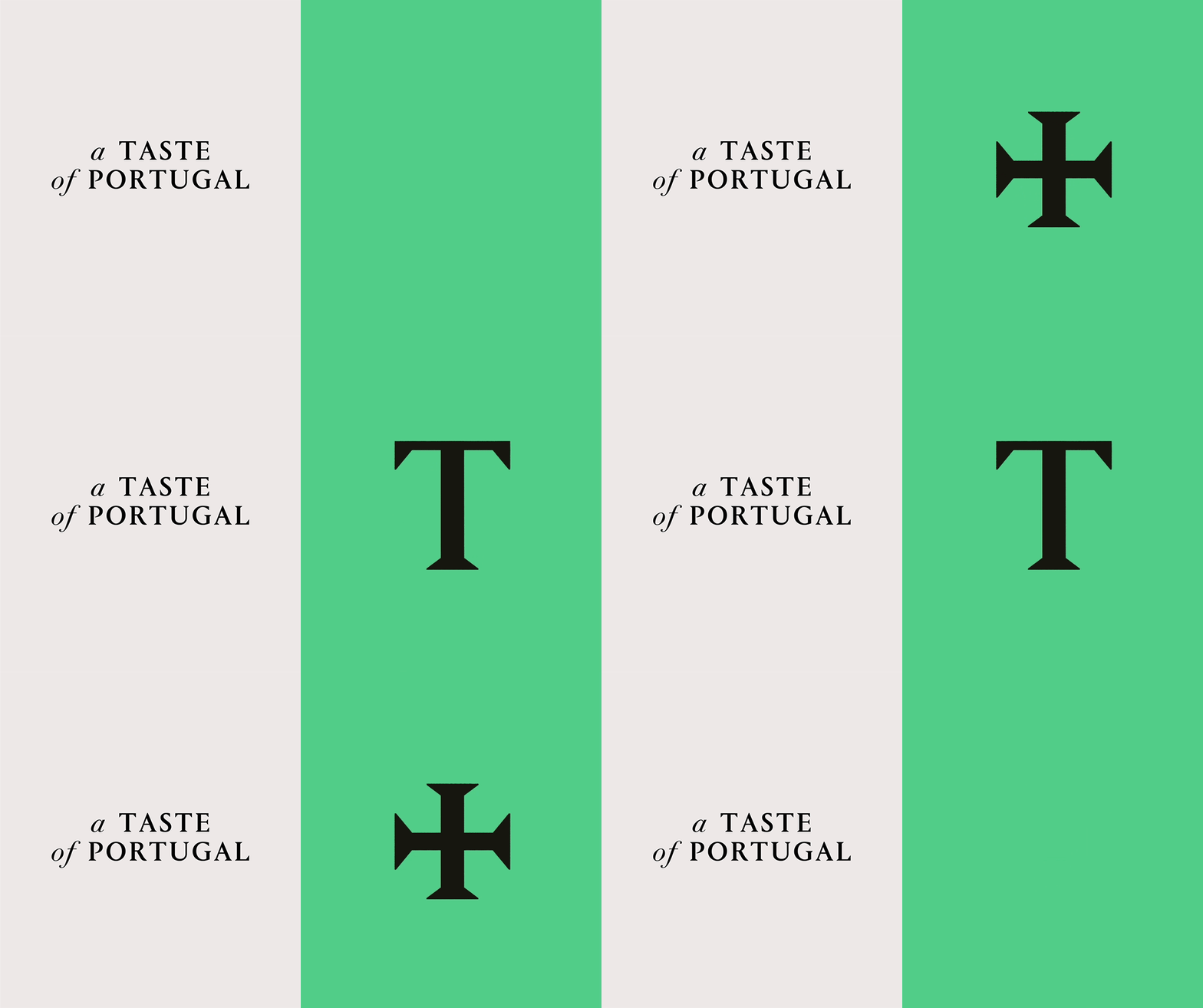
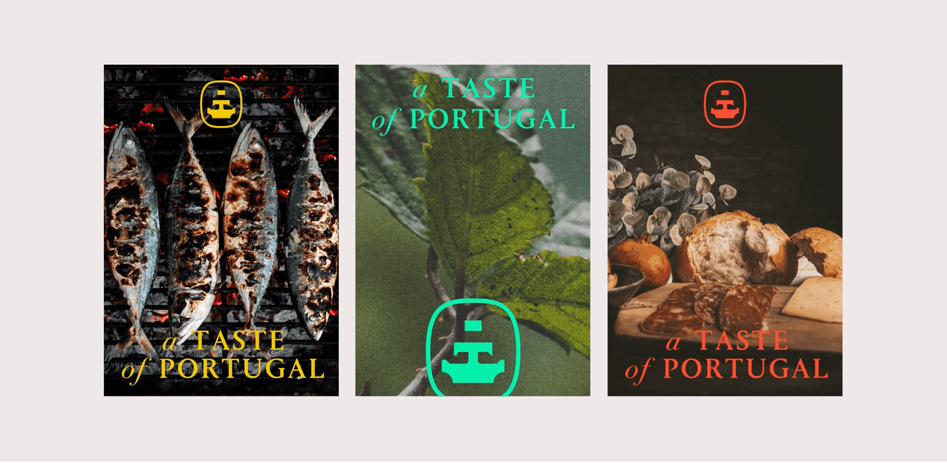
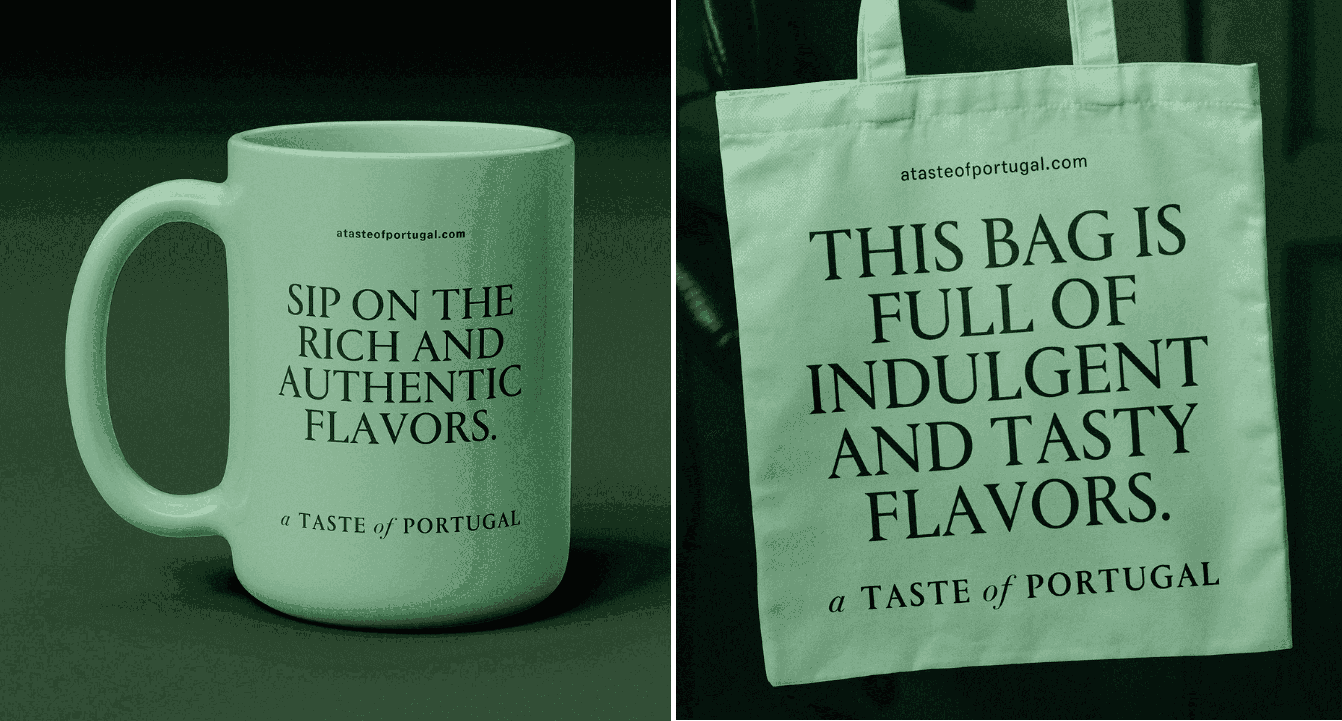
Working on the “A Taste of Portugal” rebranding involved weaving a design narrative that seamlessly integrates history with contemporary flair. From the symbolic Caravel emblem to the refined custom typography, ATOP Serif Display, our design achieves a harmonious blend of tradition and innovation. The color palette resonates with nature, power, playfulness, and trust. Every element is meticulously curated to elevate recognition, forging a visual identity that resonates across diverse audiences.
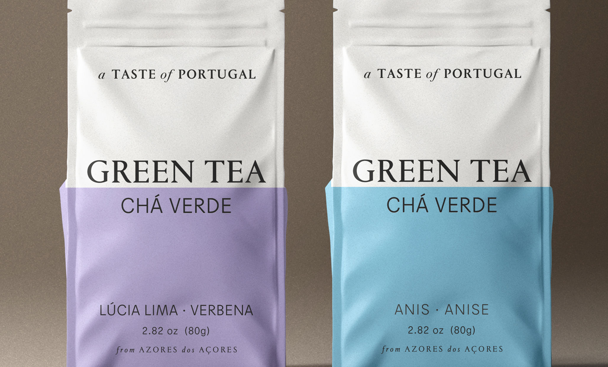
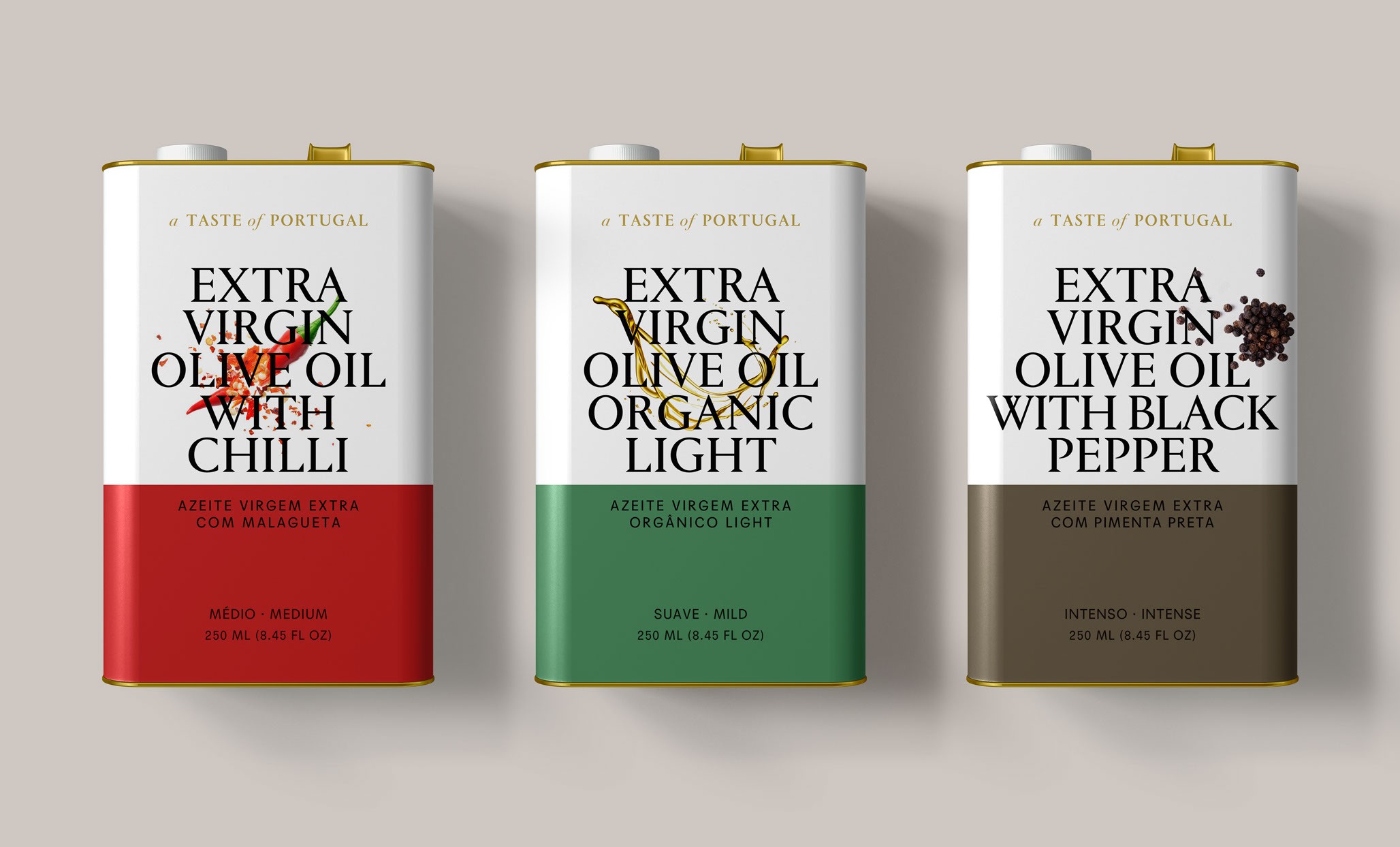
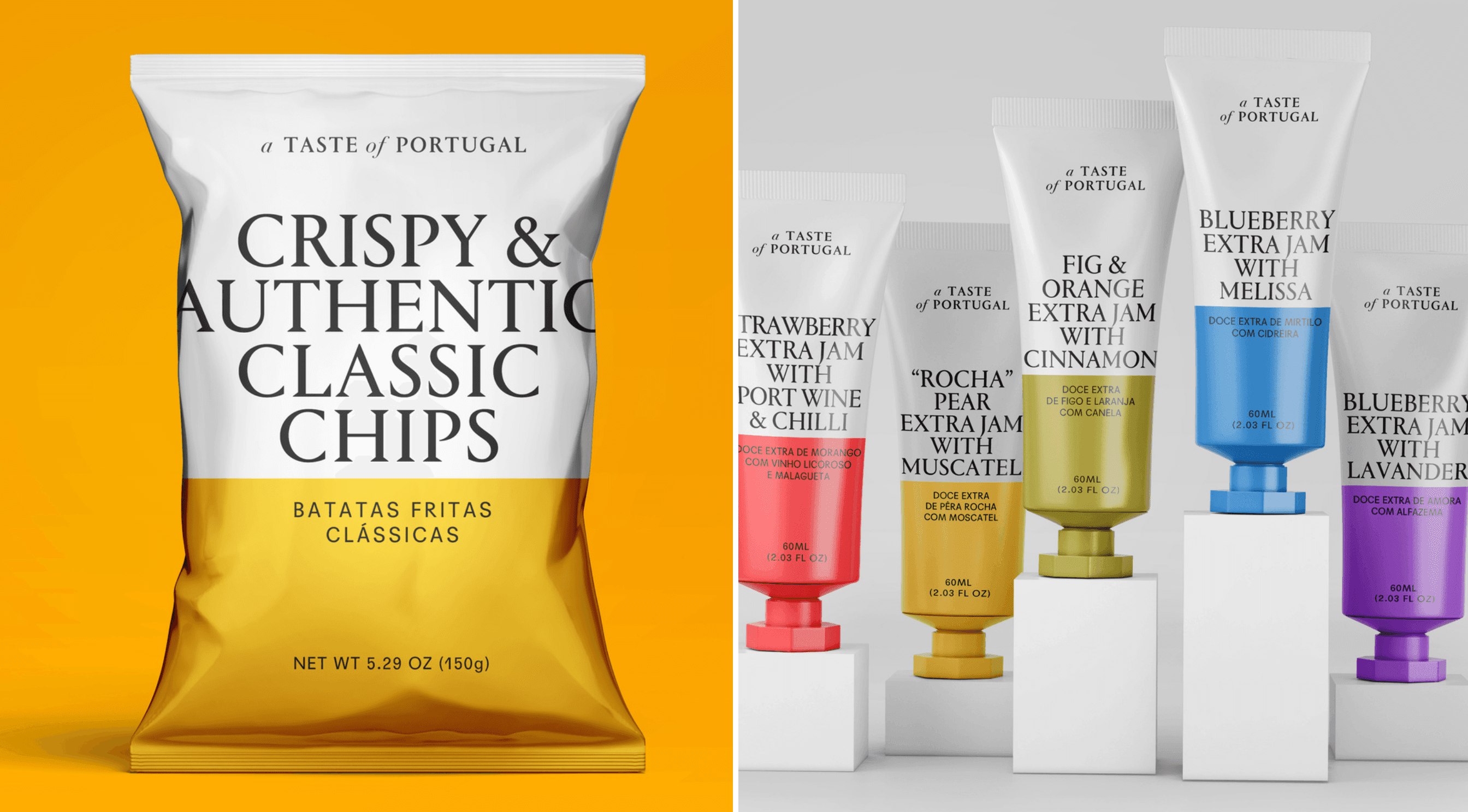
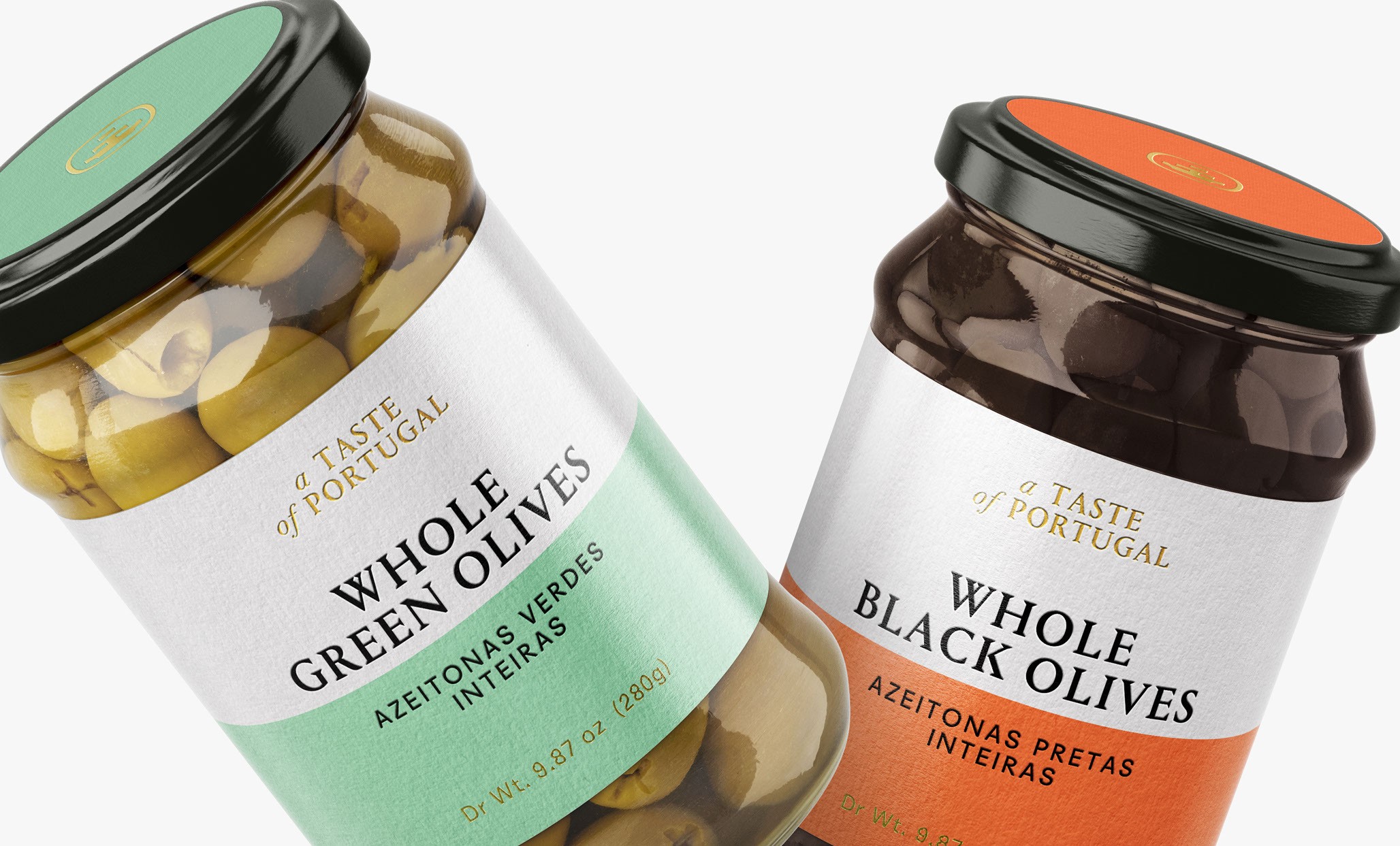
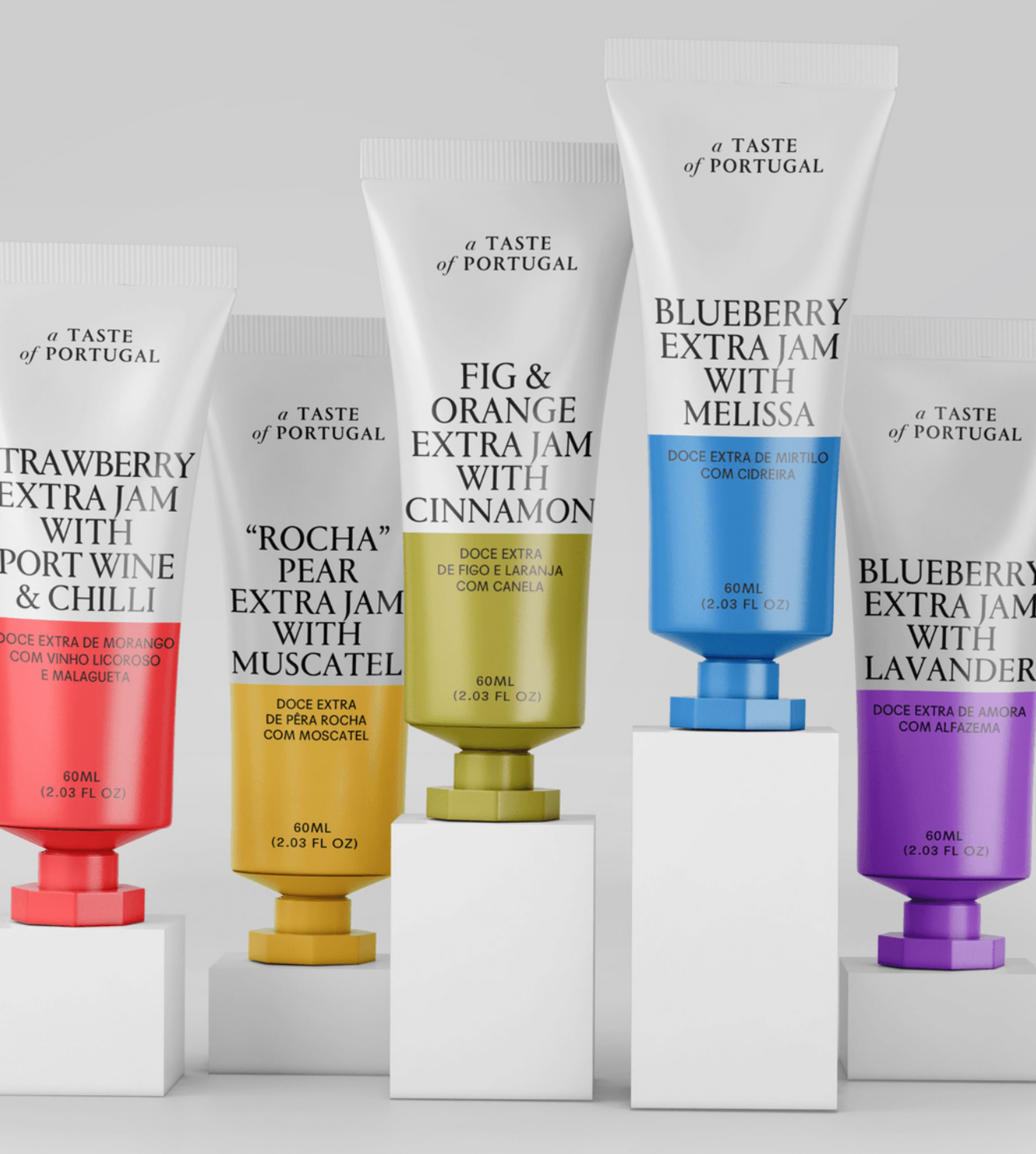
For “A Taste of Portugal” packaging, focusing on iconic Portuguese products such as olive, jam, chips, tea, and olive oil, we fused modern aesthetics with the brand’s fundamental values. Our design combines sleek, contemporary elements with subtle nods to Portuguese heritage, using minimalistic styles to emphasize quality and authenticity. The color schemes reflect Portugal’s culture, balancing sophistication with playfulness. The result is visually striking and functional packaging that enhances brand recognition and connects consumers with the charm of Portuguese products.
Year: January 2023

