Grieg Seafood
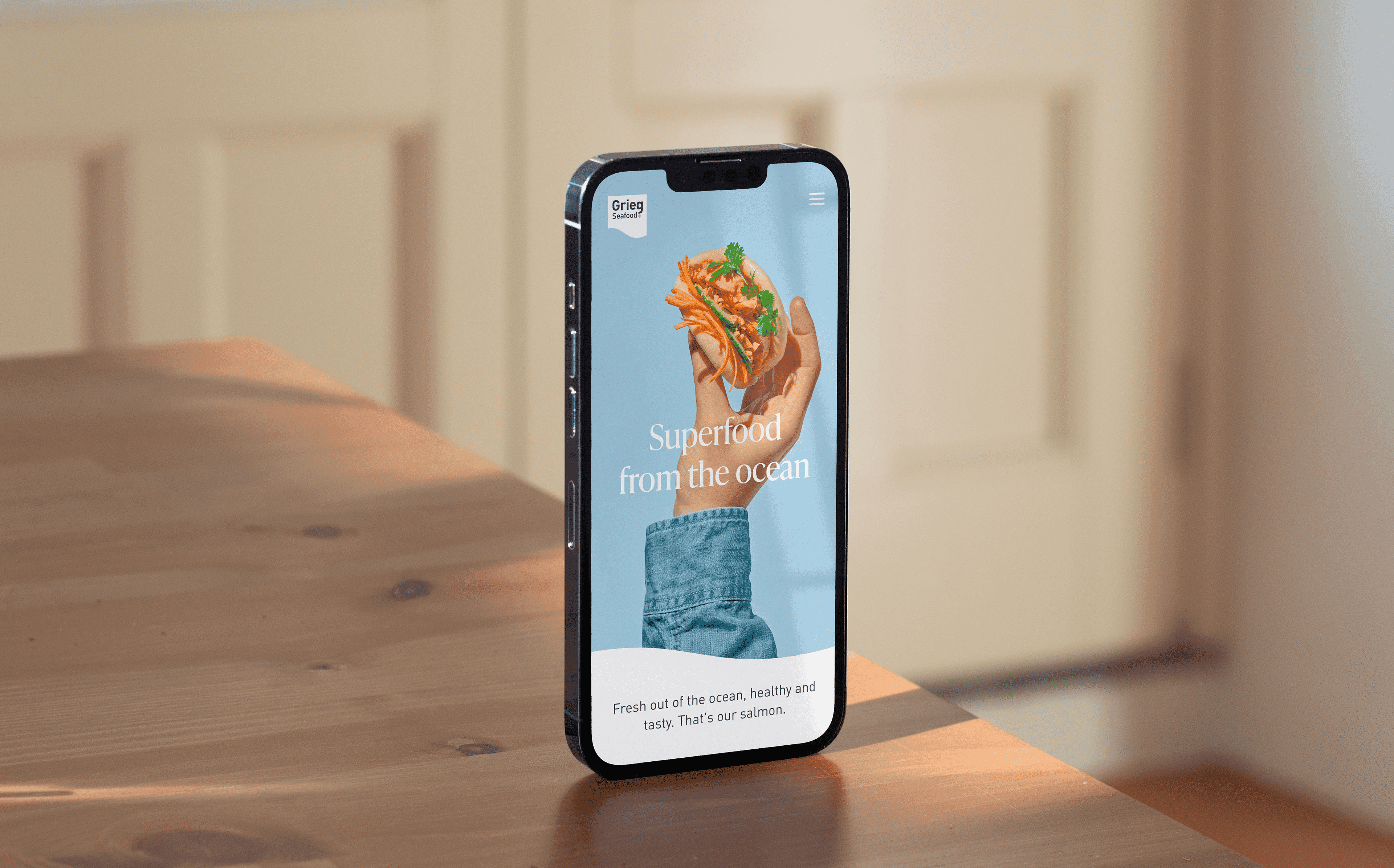
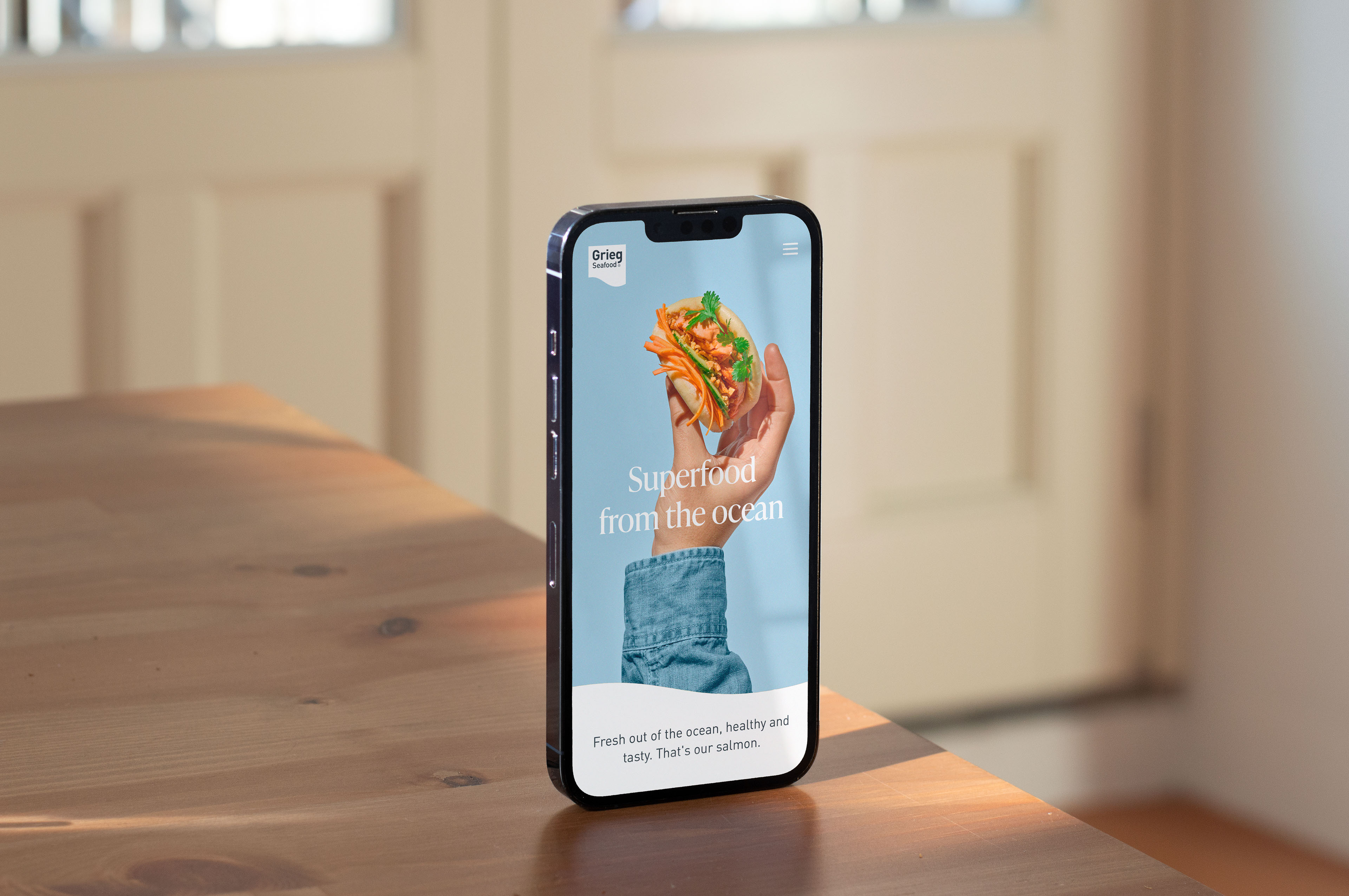
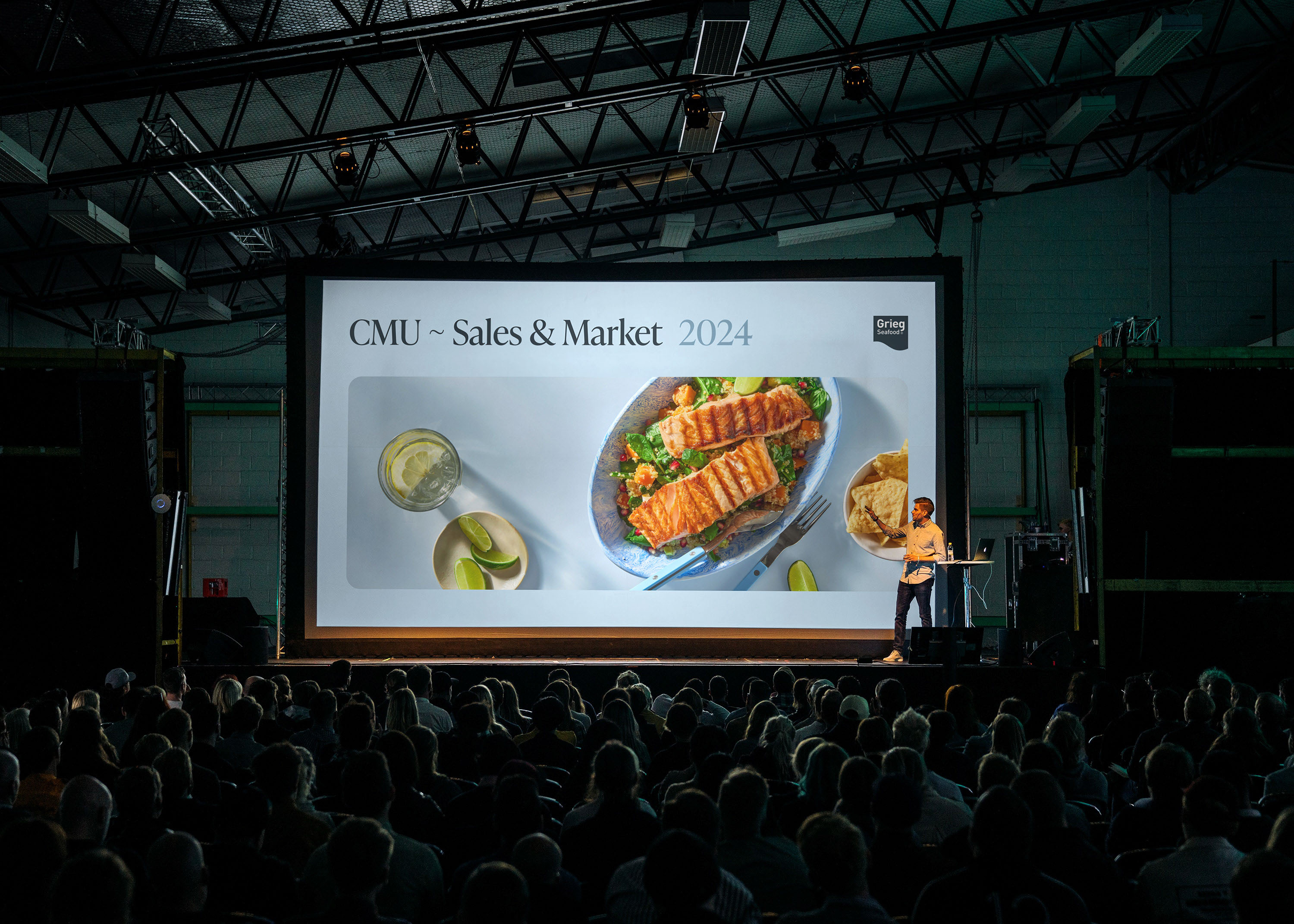
Grieg Seafood, one of the world’s largest salmon farming companies with brands in the USA, Canada, and Europe, aimed to stand out in a “blue industry” traditionally differentiated only by company size. To take a larger role in the value chain and appeal to consumers, the company adopted a bold new visual identity that emphasized food enjoyment and human connection.
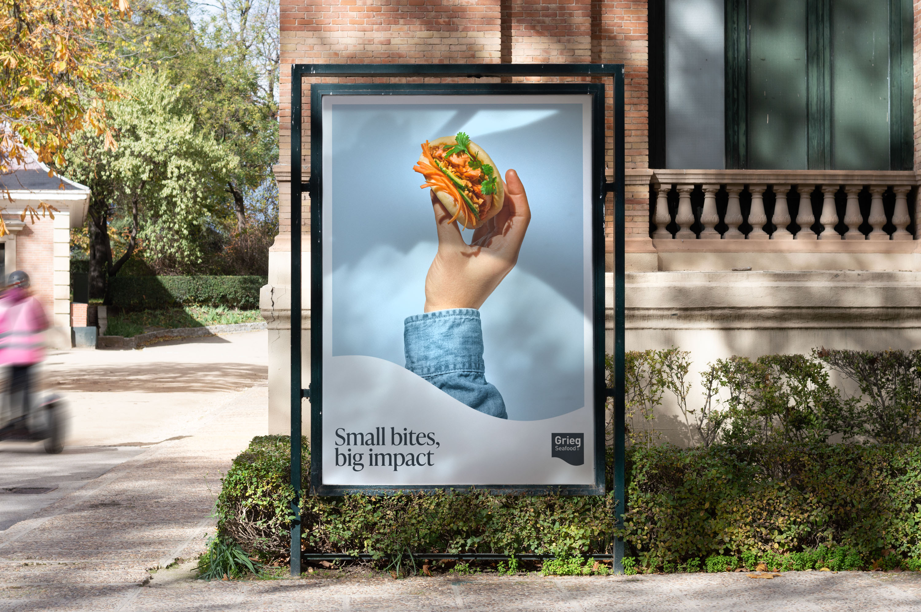
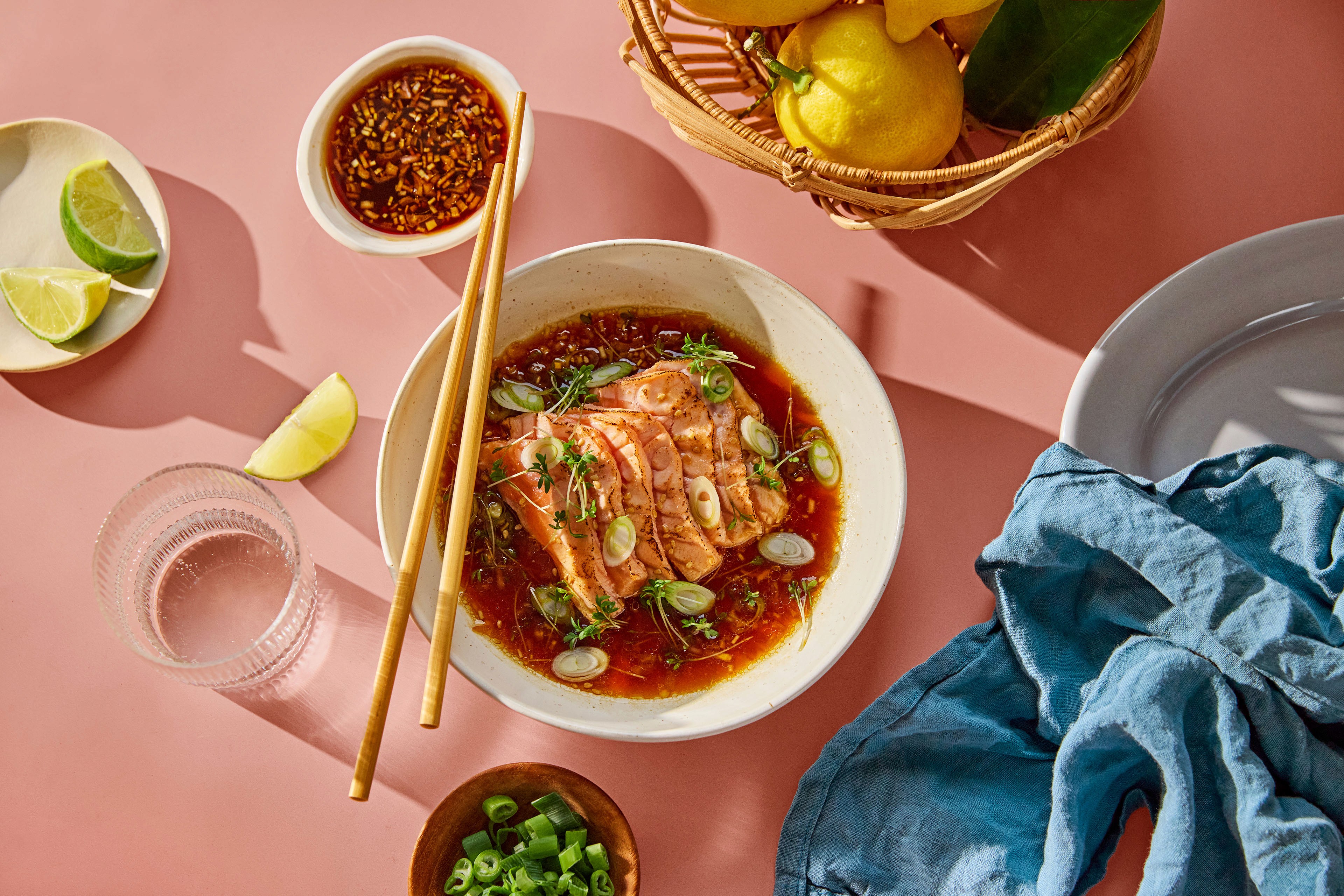
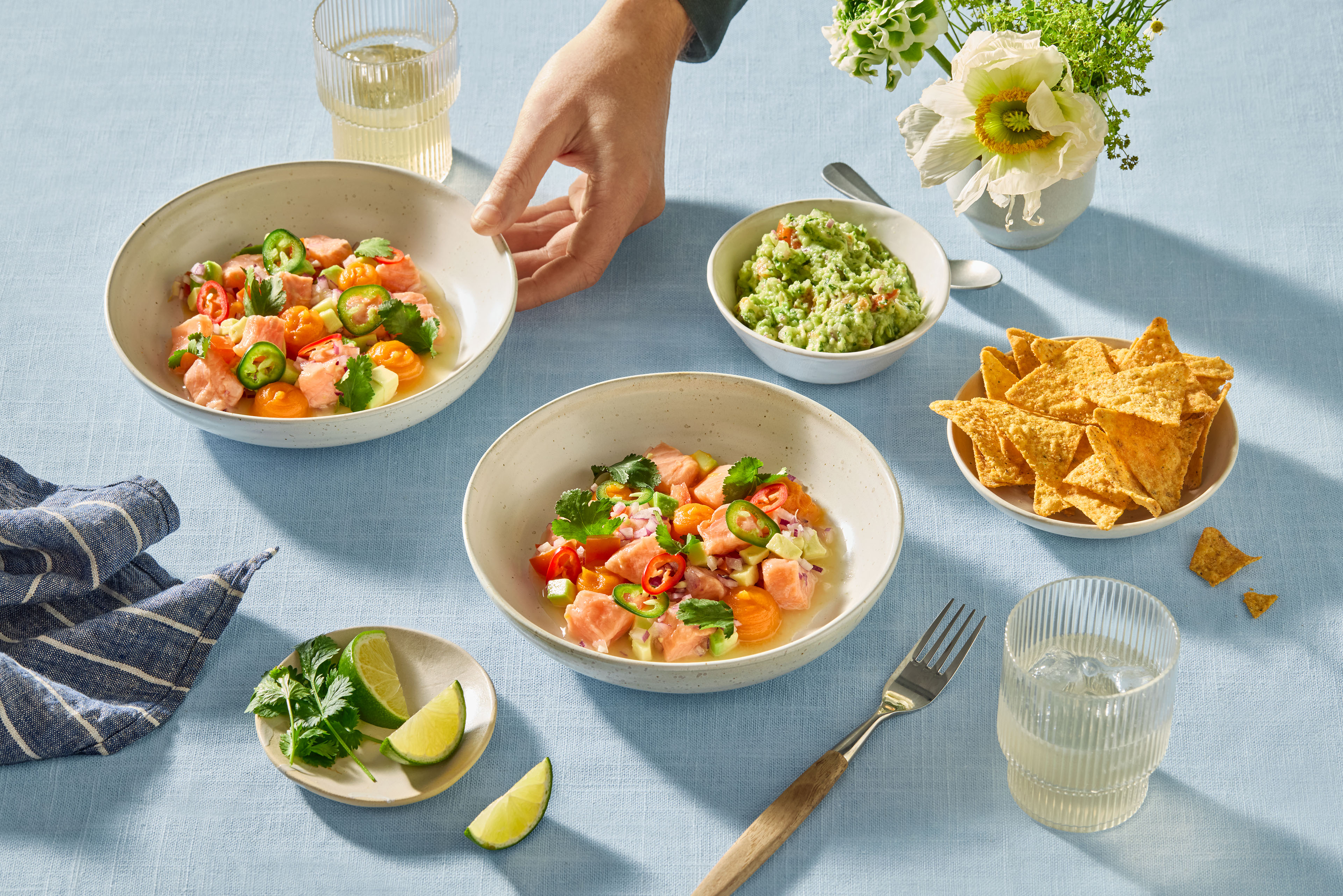
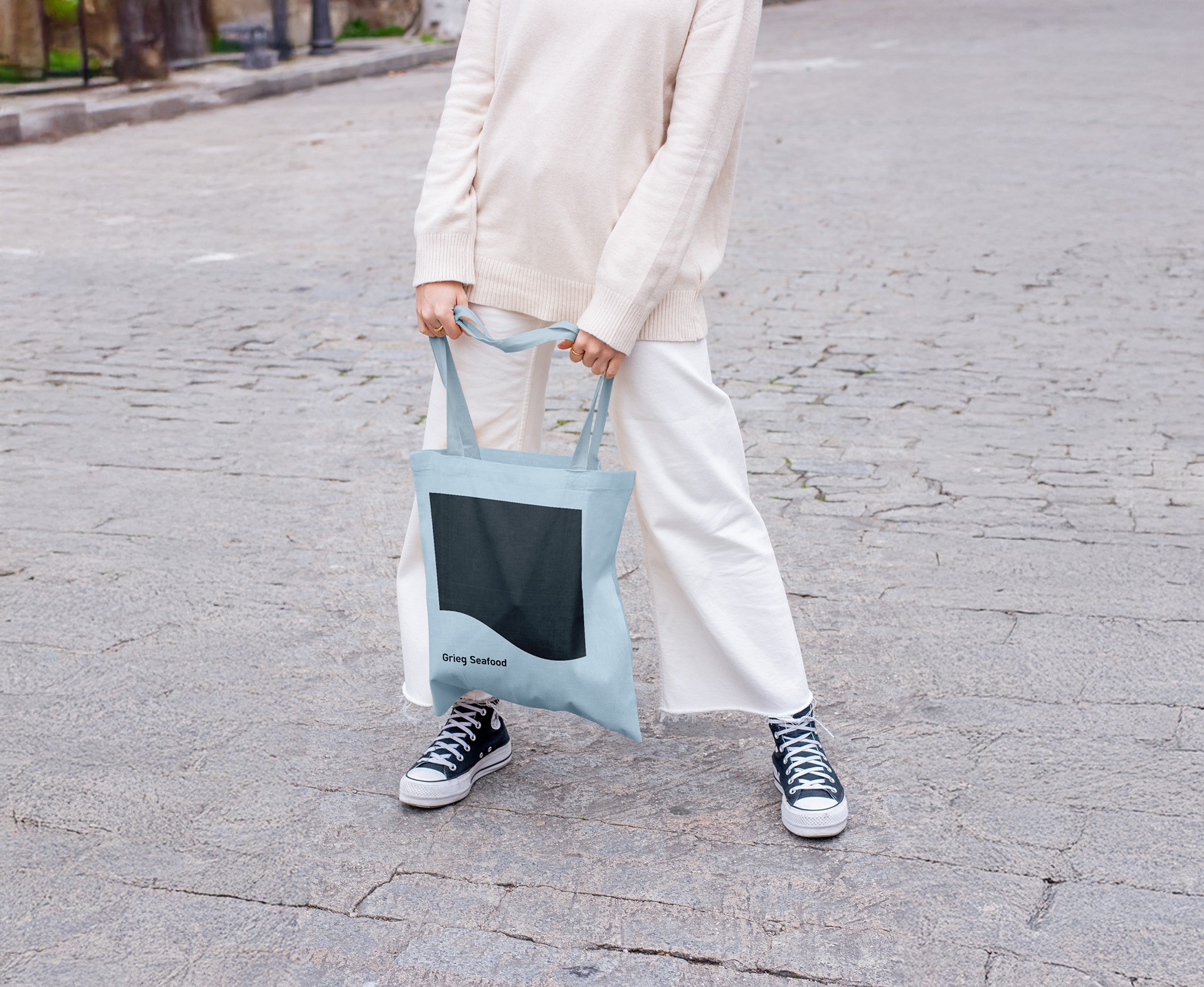
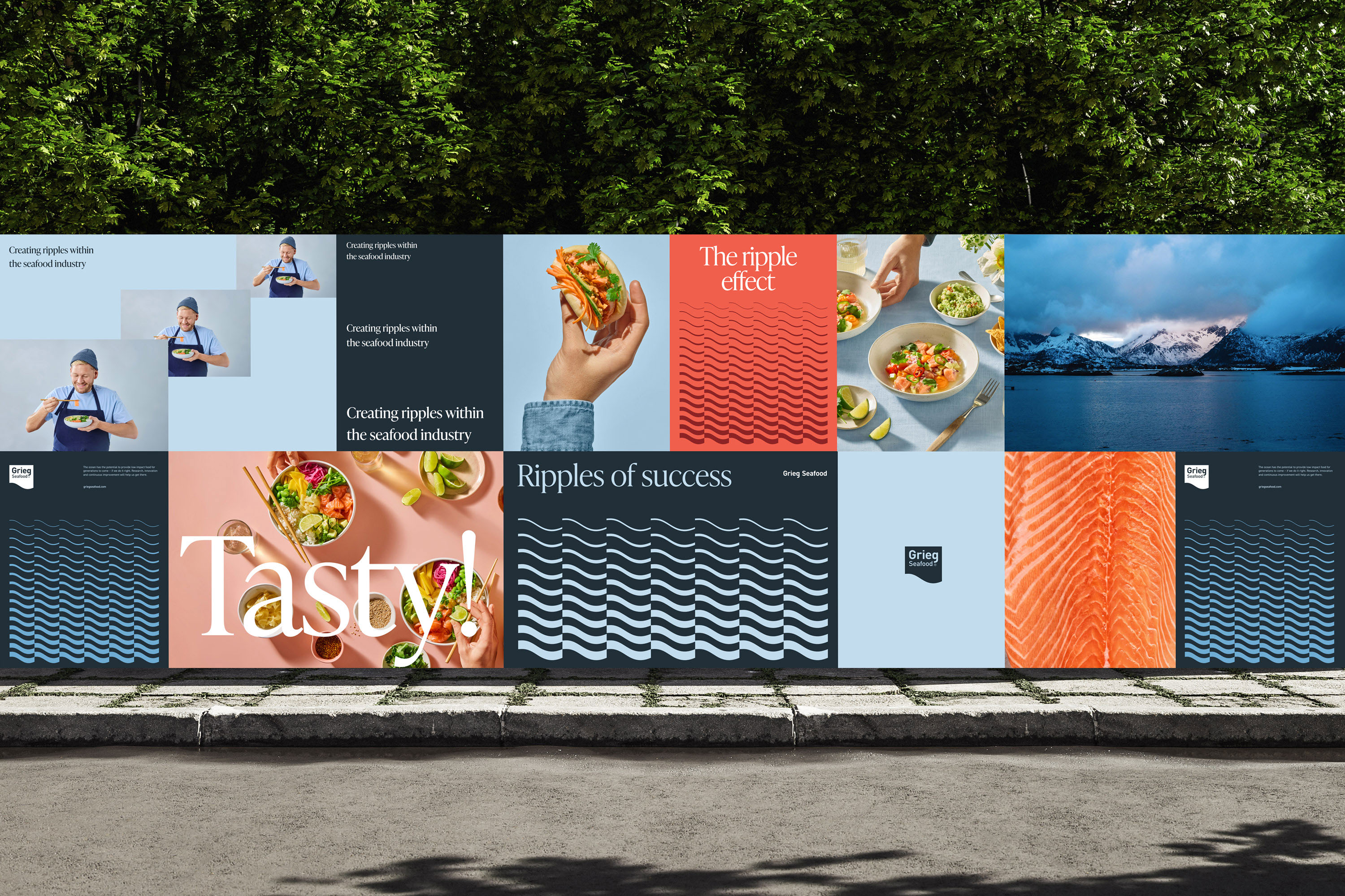
The logo’s wave-like shape inspired the creative concept Ripple Effect, symbolizing how small changes create far-reaching impact. This became the foundation of a flexible graphic system with vibrant colors, dynamic layouts, and an updated tone of voice. New imagery highlighted taste, connection, and the joy of eating, bringing the brand’s story to life.
The refreshed identity bridges the value chain from raw fish to the end consumers dinner table, distinguishing Grieg Seafood from competitors with its unique personality and adaptable design elements, including a graphic pattern derived from the logo.




Follow Mission Design Instagram
www.mission.no
