Sarc + Sigge Architects
Visual identity for Sarc + Sigge Architecture that was born when two of Finland’s top firms joined forces

Challenge
Two of Finland’s top architecture firms, SARC Architects (founded in 1965) and SIGGE Architects (founded in 1956), merged under the new Sarc + Sigge brand in early 2024. With a team of around 150 professionals, the newly formed firm is equipped to tackle increasingly complex challenges, delivering innovative, aesthetically refined, and environmentally sustainable solutions for both clients and society.As SARC and SIGGE joined forces, they required a new name, brand identity, messaging, communications strategy, and launch plan. The Helsinki-based agency Superson led the project and invited Kokoro & Moi to design the visual identity for the new firm.
Approach
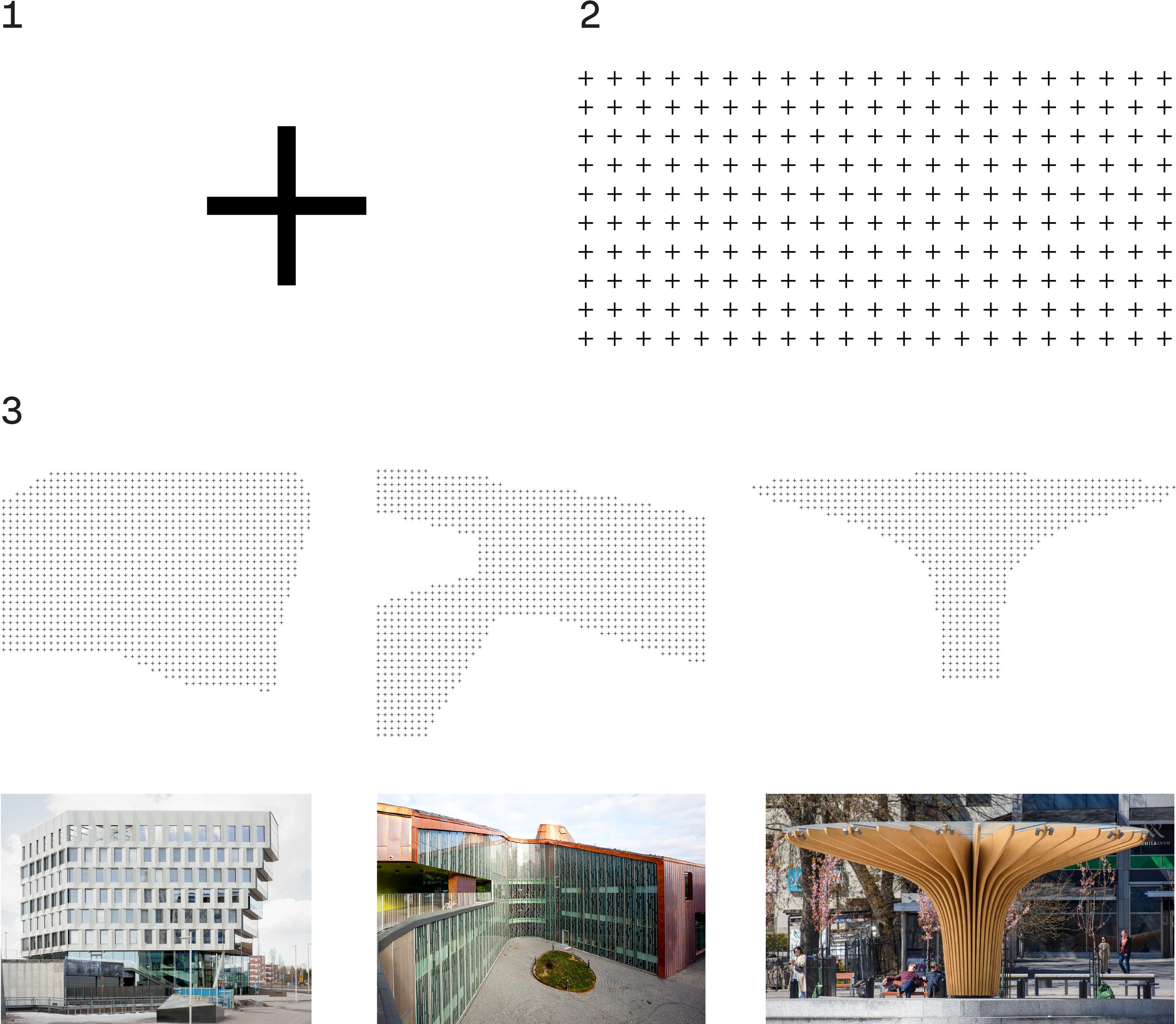
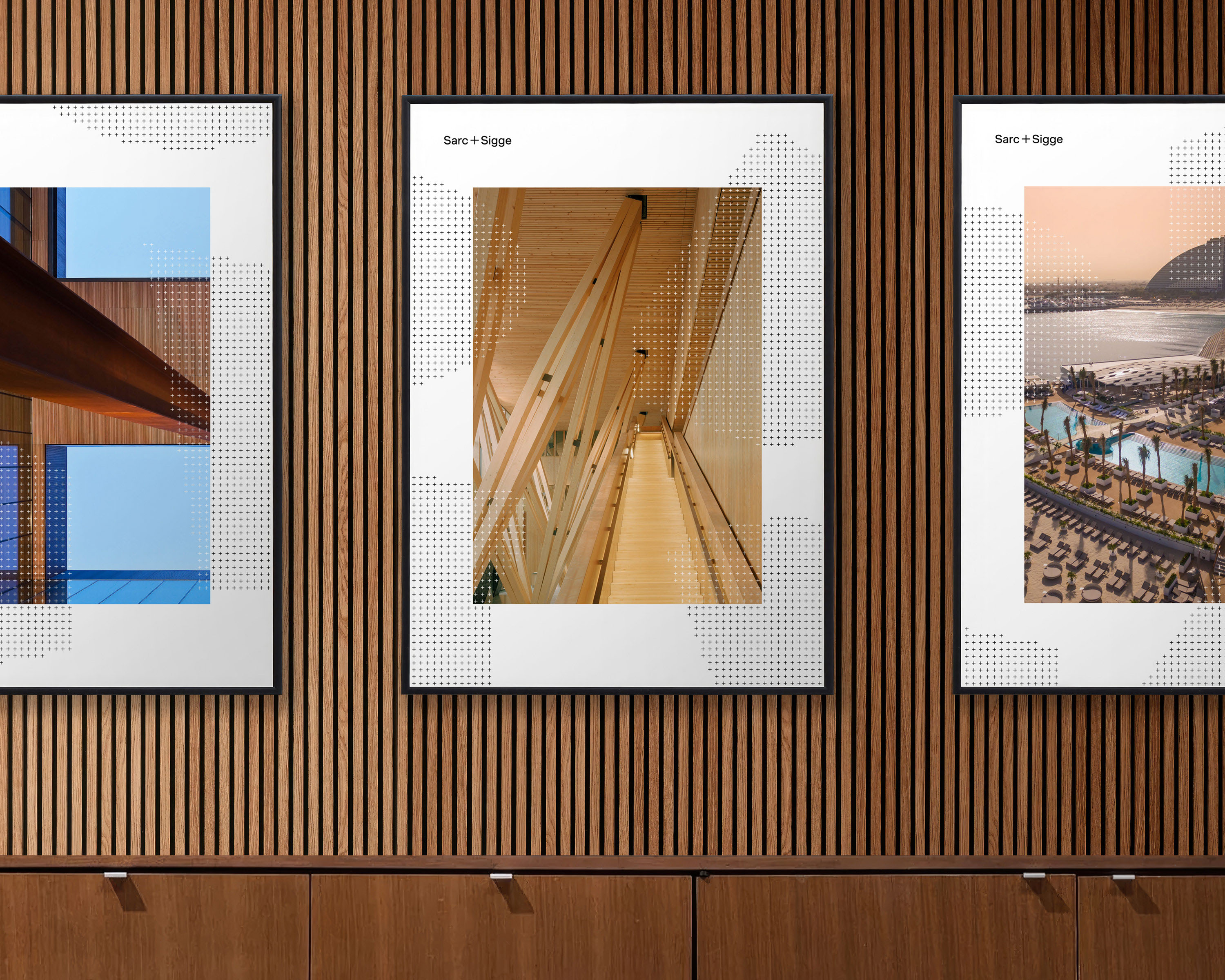
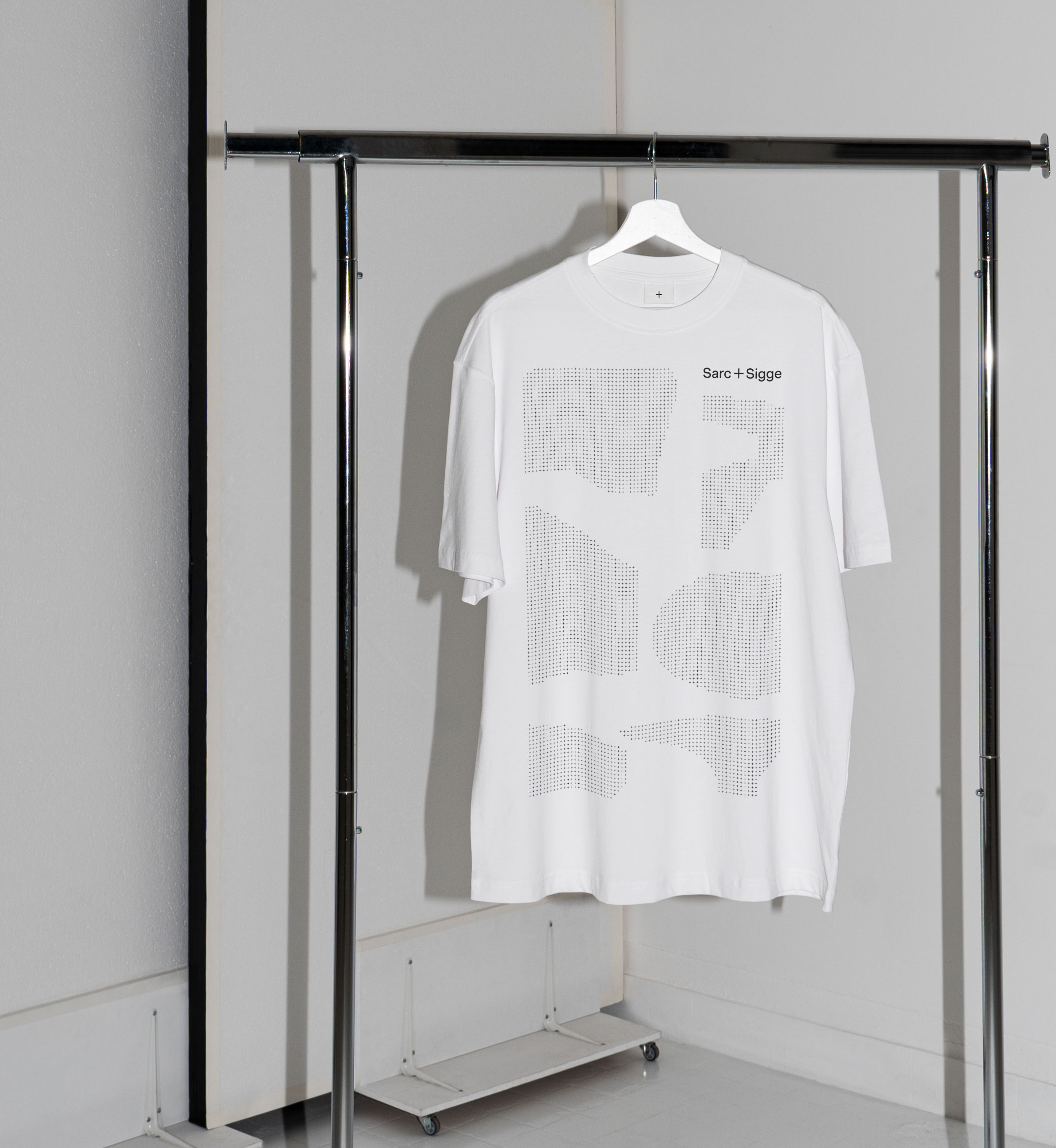
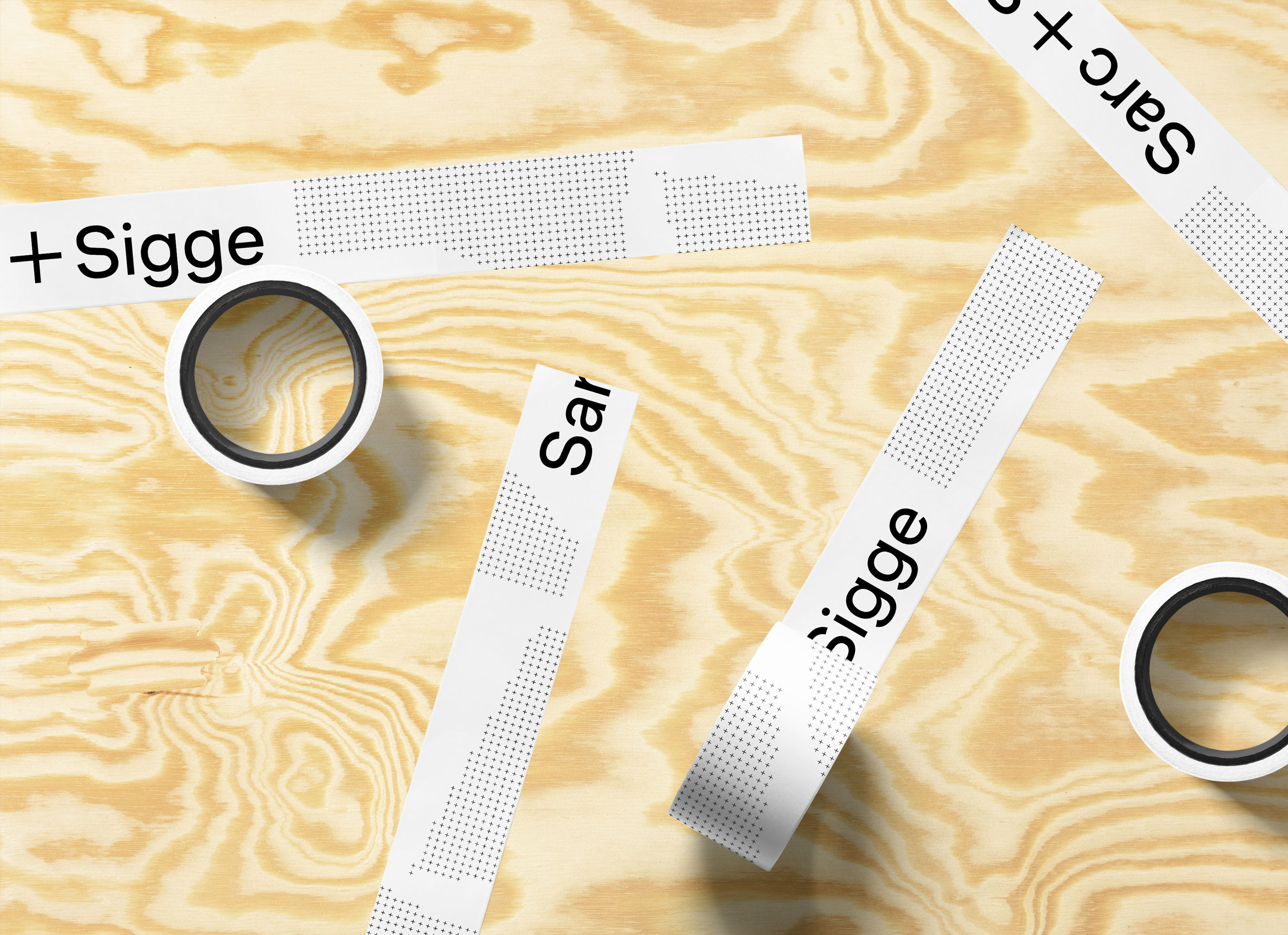
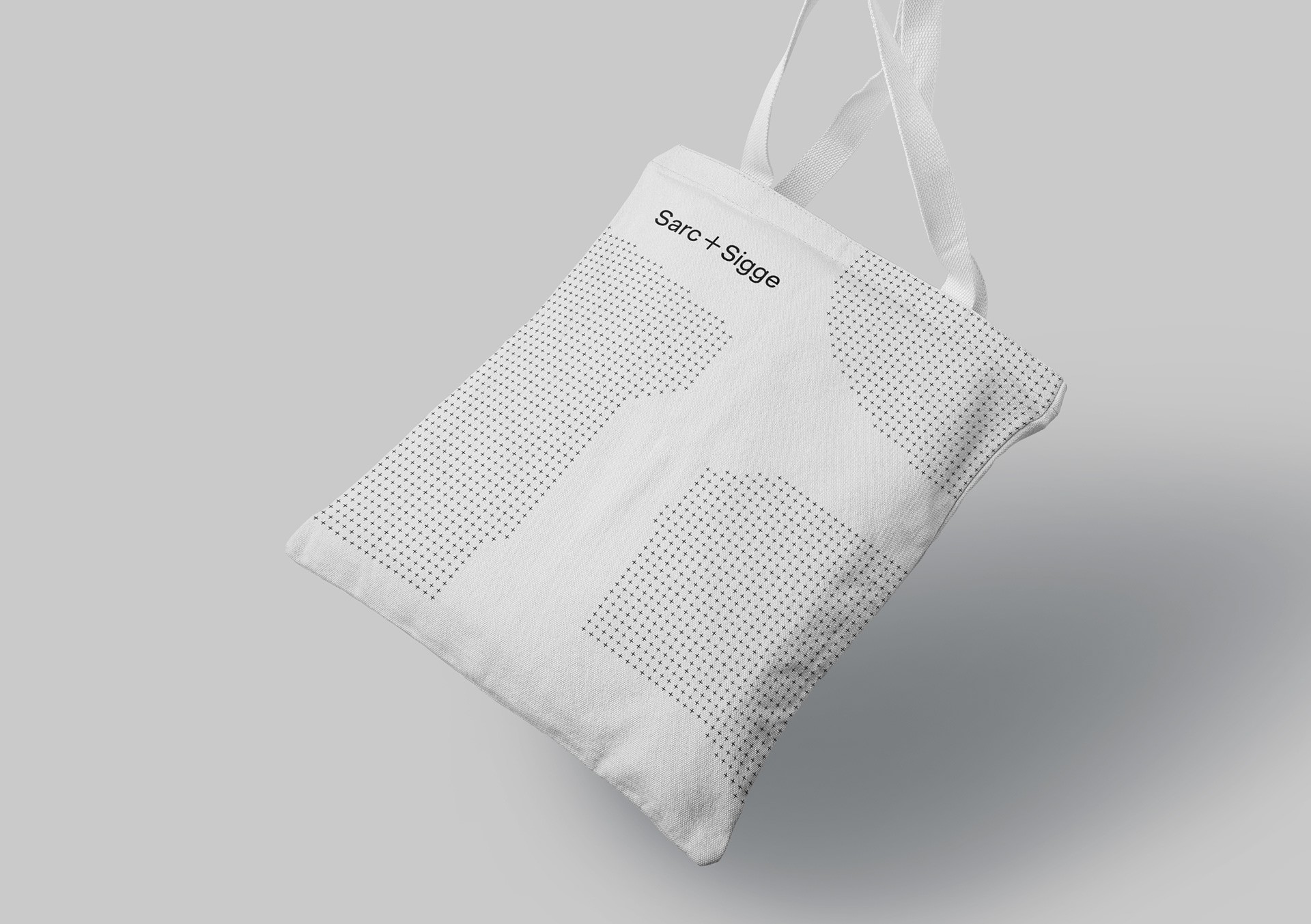
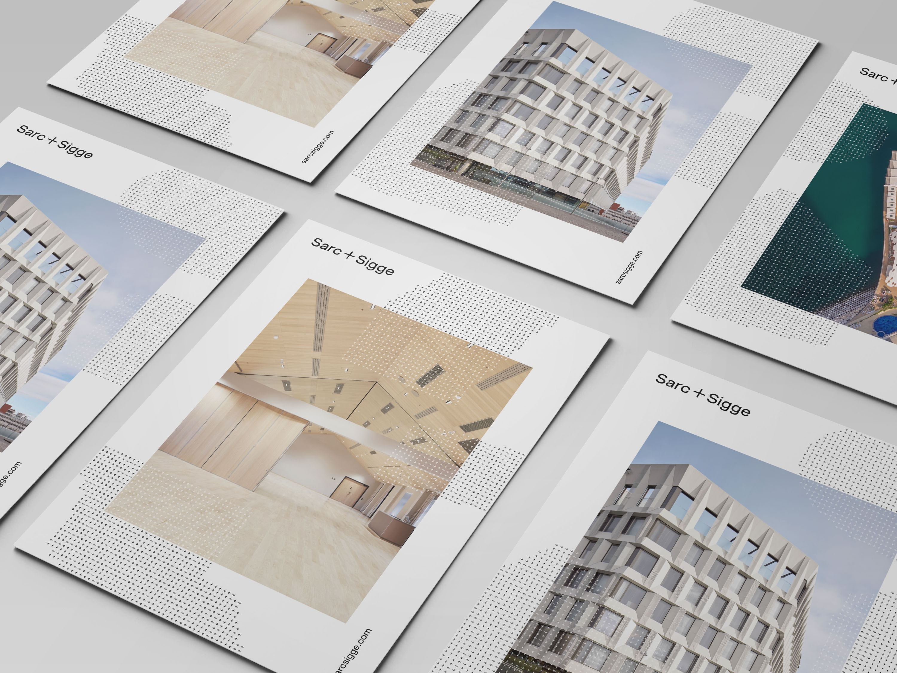
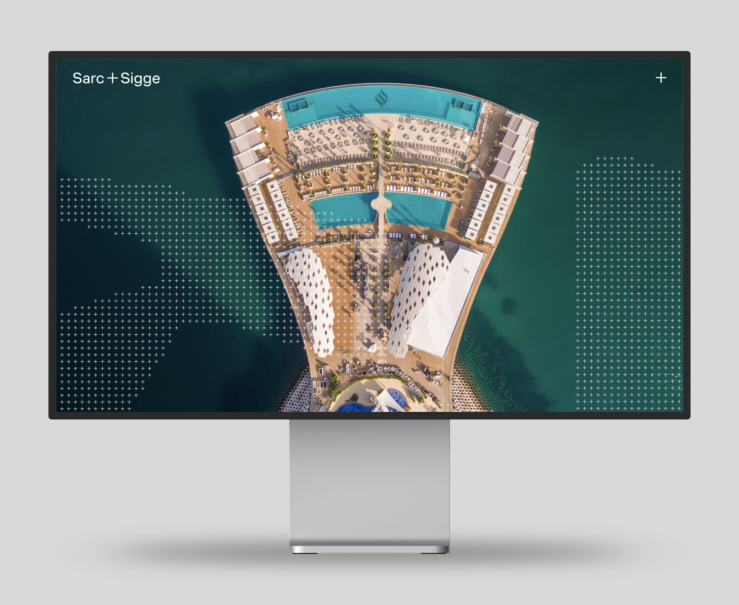
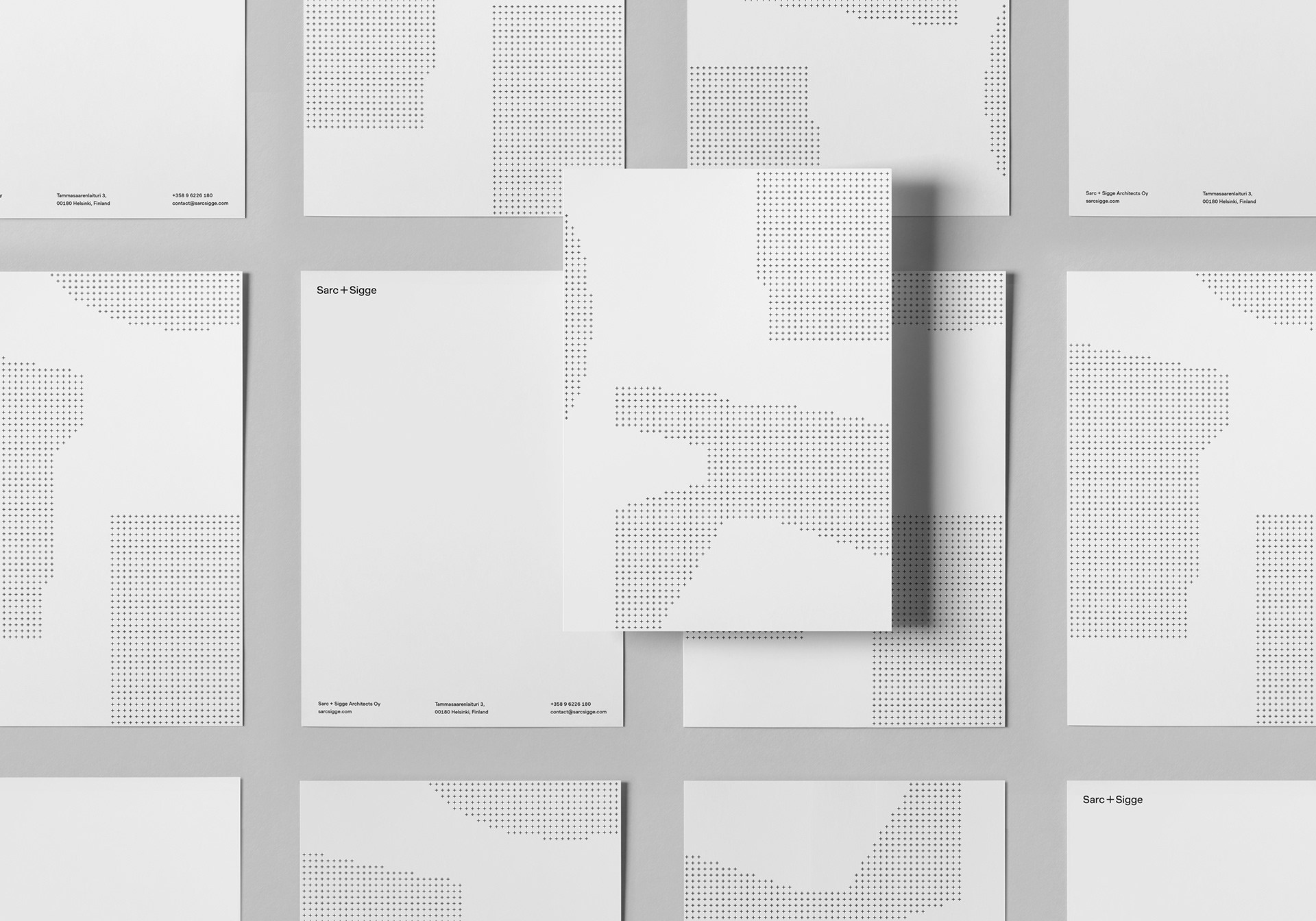
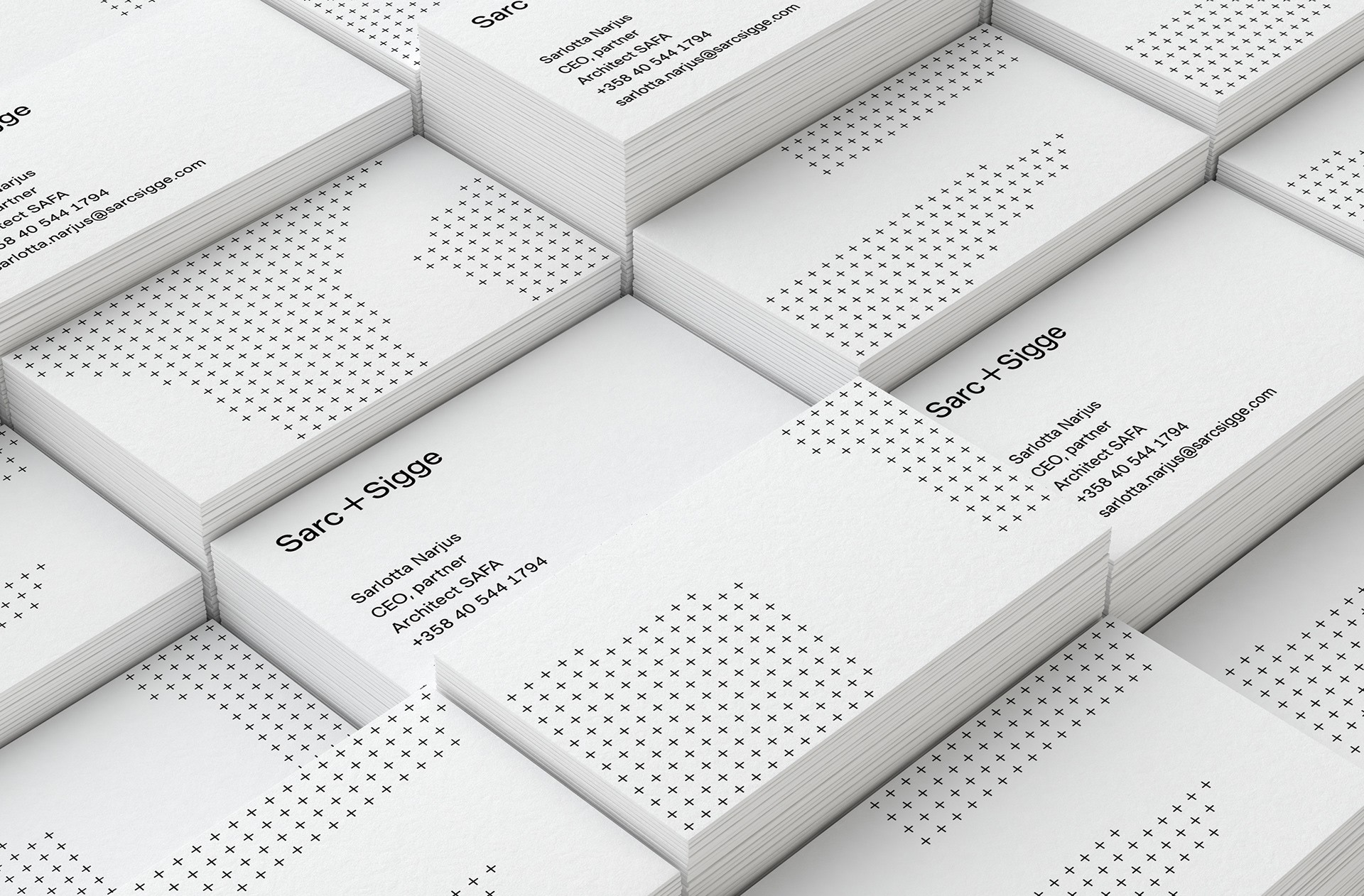
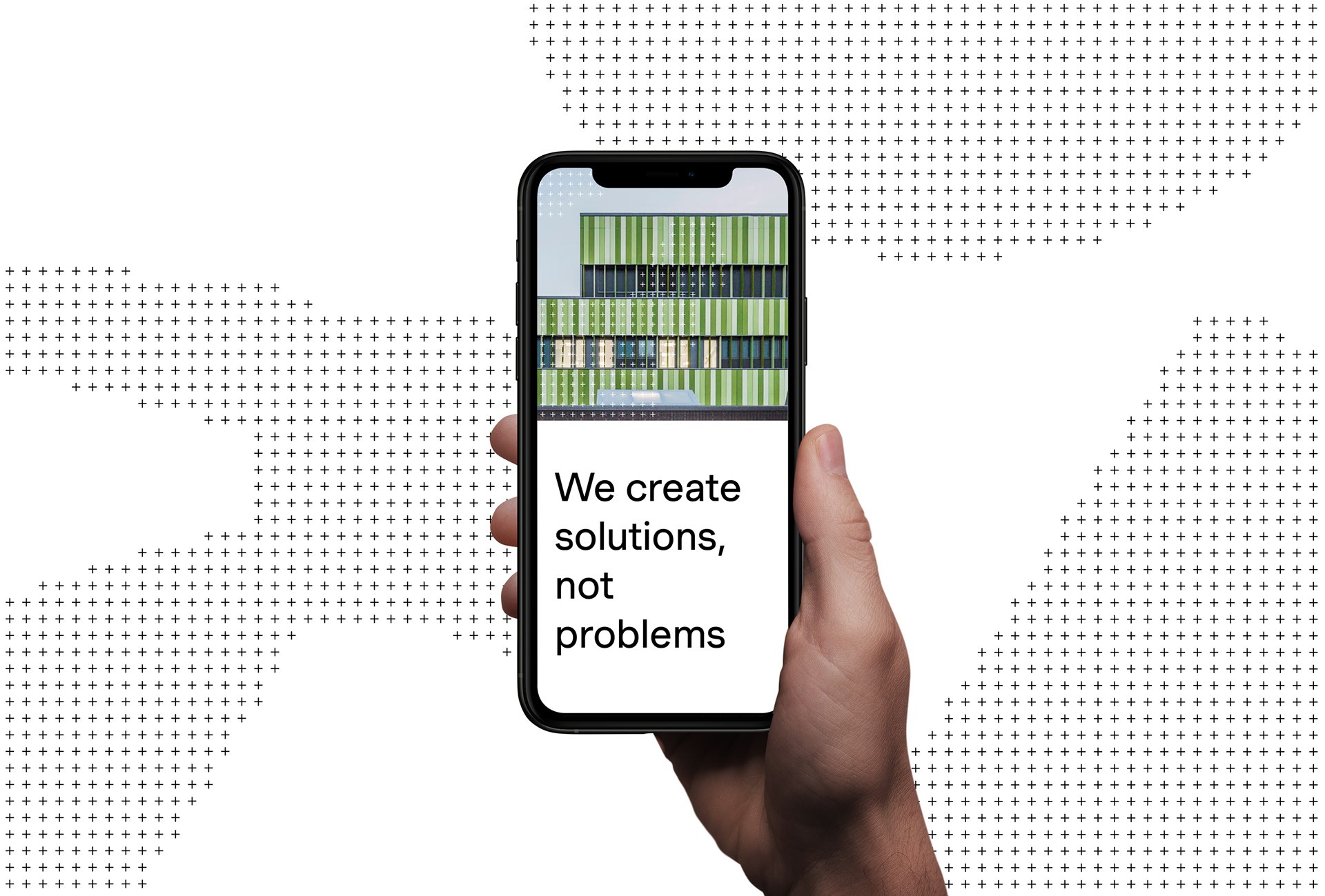
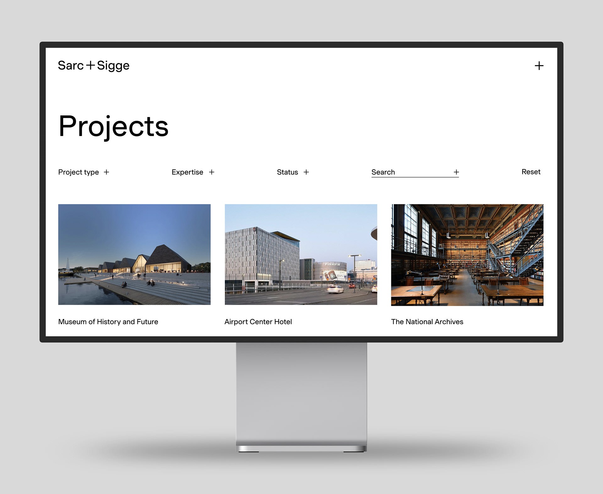
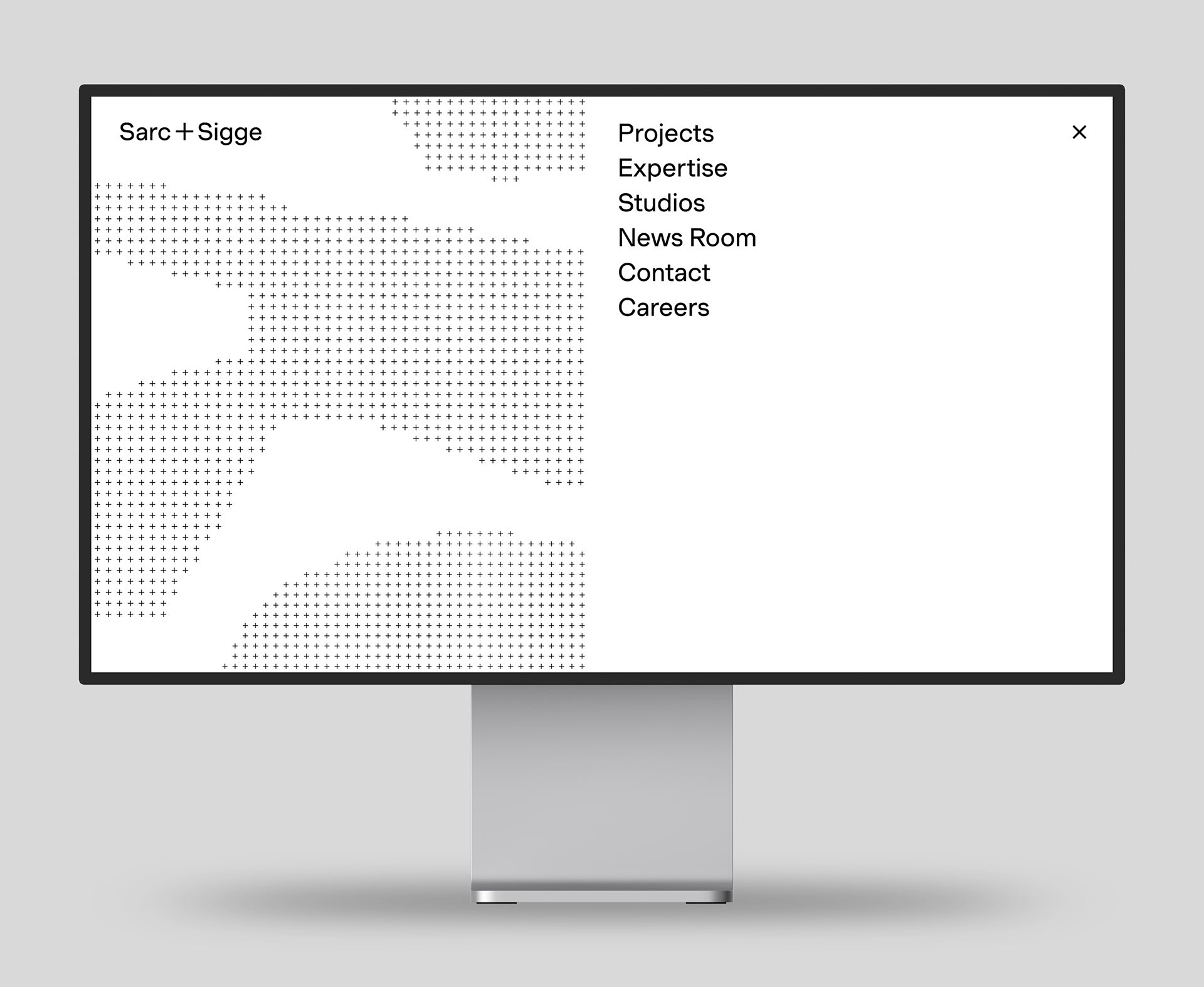
Honoring the founding eras of Sarc and Sigge, the visual identity draws inspiration from the modernist principles of graphic design in architecture and design, reimagined for a contemporary context. The identity is clean and minimalist, featuring a black-and-white color palette and sans-serif typography. The font, Muoto, released by 205 Type Foundry in 2021, is used in a single weight throughout, including for the logo that incorporates the firm’s new name. A standout feature of the logo is the “+” symbol, which is integrated into the graphic elements of the identity. The patterns created with the “+” symbol reflect the geometric details and forms found in the firm’s architecture, bringing texture and a unique visual signature to various applications.
